

Soju Man Designs started out with three distinct designs. Over the next few blogs, we’ll talk about the inspiration for them and how the designs may develop in the future. Click here for a bit more background on Soju Man Designs.
And here for the first in the series featuring the Traditional Soju Man Design.
And here for the second in the series about the Superhero Soju Man Design.
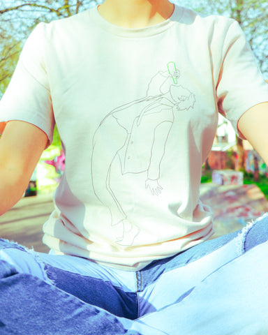
Third in the series is the Classic Soju Man Design. Designer Jae (find his Instagram profile here) again deserves all the credit for what we're convinced will become an iconic representation of the brand.

The way Jae has articulated the ideas we talked about in this form blew me away. I think it's graceful, exciting, and tense all at the same time. The green soju bottle refines it to perfection.
The dream is that one day, this becomes as recognisable as the Air Jordan logo - got to aim high.
After setting such a high bar, I'm intrigued to see what the next design in this series might look like. The smoothness often reminds me of ballet.
Check out the Soju Man Designs collection.
Soju Man Designs Instagram.
Soju Man Designs on Facebook.